Maybe when you designed your company logo, you put your whole heart and soul, and maybe even a picture of company culture, into the design. The lines, curves, and colors were carefully selected to tell your story and convey who you are.
On the other hand, your design process may have been a little more utilitarian—a basic text logo of the company brand to simply answer the question, “What’s Your Name?” You may have taken it a step further with a little stylization, but the process was more intuitive than planned—Hey, that looks good!
Either way, unless you’re embarking on a rebranding journey, you’re making your living off of your current logo and it has to look great every time it’s displayed or printed. And sometimes your logo will stand out better if you’re willing to modify colors or shapes while still retaining the feel of your brand.
Colors
Many logos use 2 or 3 colors, or are even “full” color (usually printed with 4 inks, called process colors). On a white background, art with multiple colors looks great. The colors are vivid and the feel of the original design is clear.
But when a logo with many colors appears on some backgrounds, it can reduce its branding effectiveness.
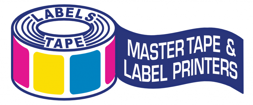
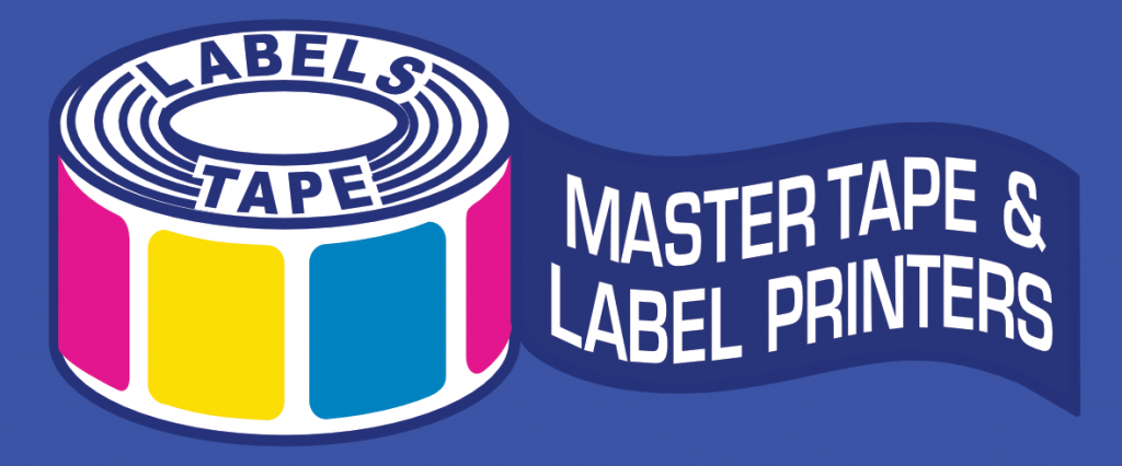
Having a good single-color logo option can allow the logo to stand out on nearly any color, image, or pattern background. An all-white version for dark backgrounds, and a solid dark version (such as black, blue, or your brand color) for light backgrounds gives you the flexibility to use the best color option for the printing application.
The “Core” Logo
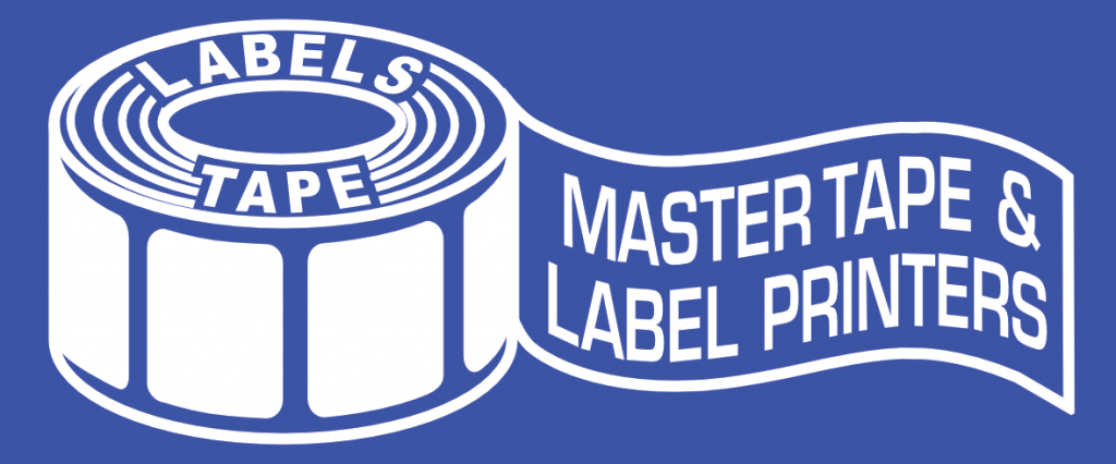
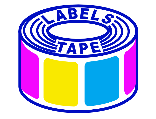
Sometimes space or size dictate that a simpler version of a complex logo will better communicate the brand. A horizontal logo doesn’t translate well to small square formats, especially when text is included. Logos with larger imagery surrounded by smaller text may also need to be simplified in smaller formats. Rather than the full logo, Master Tape & Label Printers can choose to (1) focus on the tape-roll icon portion of the logo for a square or circular format. Or another choice (2) is the brand name banner portion of the logo (trimming the tape roll off).
1
2
Let Your Brand Do the Talking
As you plan your promotions, consider how various types of art and printing will affect the display of your logo. Creating logo variations early on will help all your promotions to stay true to your brand voice. And when you can provide the best logo variation to a graphics designer or to your printing partner, it ensures that the highest quality version (that stays consistent with all your other art) is used, rather than one that a 3rd party has to put together on the fly. That way, you can feel confident that your printed labels and other promotions will look great, and fit your brand perfectly!
1
2
